The success of a website is often measured by how frequently users do what you want them to do. A lot of UX design effort goes into making it easy for them to do things right, but how often do we design so that users can do no wrong? This morning, I discovered that Kroger has applied this principle in a very effective way.
Kroger works hard to track their customers' purchase patterns by diligently reminding them to scan their frequent shopper card at the beginning of each transaction. For a variety of reasons irrelevant to this post, I don't shop at Kroger often, but when I do, I always use my account for the instant discounts, especially the 3¢/gallon discount on gasoline. The problem is, I lost my card long ago, so at the checkout I have to type in our old telephone number that's associated with our account.
Oddly enough, I never have this problem when pumping gas. I simply scan my key tag card and get the discount. I did this last night without thinking while filling my gas can for my generator.
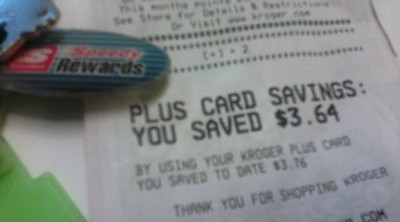
This morning, I forgot to stop at my regular grocery store, so I dropped into another Kroger near work to pick up lunch-making supplies. At the checkout, I went to scan my key tag, but (as usual) noticed that my Kroger card wasn't there. The only thing I had was my Speedy Rewards tag from Speedway.
But it worked last night. So I scanned the Speedy Rewards card and it worked.
Kroger has clearly decided that any tracking - even of a competitor's card - is better than no tracking at all. So they've made it impossible to fail at the checkout counter by allowing customers to scan any card with a recognizable UPC label.
I never would have noticed that I'd done it wrong if the two transactions weren't so close together. I can see great opportunities here for adapting web actions to match what the user wanted, rather than throwing them an error message and making them try again. It might not work everywhere, but it's something to consider when building new interfaces.
This post was migrated and back-dated from my original post on Tumblr, which I have decided to move here.